Tutorial kali ini kita akan mencoba bagaimana membuat menu atau navigasi sebuah website tetap berada di tempat (fix) ketika kita scroll halaman. Jadi langsung saja kita menuju tutorialnya.
Buatlah sebuah file dengan nama index.html, yang isinya kurang lebih sebagai berikut:
<!doctype html>
<html lang="en-US">
<head>

	<!-- Meta tags & title /-->
	<meta http-equiv="Content-Type" content="text/html; charset=utf-8" />
	<meta name="viewport" content="width=device-width, initial-scale=1, maximum-scale=1">
	<meta name="robots" content="all,index,follow" />

	<title>Scroll To Top Then Fixed Navigation Effect With JQuery and CSS</title>
	<meta name="description" content="Create a sticky navigation bar that remains fixed to the top after scroll" />

	<link rel="stylesheet" type="text/css" href="css/style.css" /> <!-- Main stylesheet /-->

</head>

<body>

<section id="screen1">

	<p>Scroll down</p>

	<nav>
		<ul>
			<li><a href="#">Home</a></li>
			<li><a href="#">About</a></li>
			<li><a href="#">Services</a></li>
			<li><a href="#">Team</a></li>
			<li><a href="#">Contact</a></li>
		</ul>
	</nav>

</section>

<section id="screen2"></section>
<section id="screen3"></section>

<script type="text/javascript" src="http://ajax.googleapis.com/ajax/libs/jquery/1.10.2/jquery.min.js"></script>

<script>
   $(document).ready(function(){
	   $(window).bind('scroll', function() {
	   var navHeight = $( window ).height() - 70;
			 if ($(window).scrollTop() > navHeight) {
				 $('nav').addClass('fixed');
			 }
			 else {
				 $('nav').removeClass('fixed');
			 }
		});
	});
</script>

</body>
</html>
Buatkan sebuah file.css isinya sebagai berikut:
/*
Tutorial Name: Scroll To Top Then Fixed Navigation Effect With JQuery and CSS
Description: Create a sticky navigation bar that remains fixed to the top after scroll
Author: Stanislav Kostadinov
Author URI: http://stanislav.it
Version: 1.0.0 - 11.01.2014
*/

* {margin: 0; padding: 0;}

a {text-decoration: none;}

/* This class is added on scroll */
.fixed {
	position: fixed;
	top: 0;
	height: 70px;
	z-index: 1;
}

body {
	color: #fff;
	font-family: 'open-sans-bold';
	font-size: 18px;
	text-align: center;
}

/* Font Face Settings */
@font-face {
    font-family: 'open-sans-bold';
	src: url('../fonts/open-sans/OpenSans-Bold.eot');
    src: url('../fonts/open-sans/OpenSans-Bold.eot?iefix') format('embedded-opentype'),
		 url('../fonts/open-sans/OpenSans-Bold.ttf');
    font-weight: normal;
}

/* Navigation Settings */
nav {
	position: absolute;
	bottom: 0;
	width: 100%;
	height: 70px;
	background: #fff;
}

nav li {
	display: inline-block;
	padding: 24px 10px;
}

nav li a {
	color: #757575;
	text-transform: uppercase;
}

section {
	height: 100vh;
}

/* Screens Settings */
#screen1 {
	background: #43b29d;
}

#screen1 p {
	padding-top: 200px;
}

#screen2 {
	background: #efc94d;
}

#screen3 {
	background: #e1793d;
}

@media only screen and (max-width: 520px) {

	nav li {
		padding: 24px 4px;
	}

	nav li a {
		font-size: 14px;
	}

}
Pada tutorial diatas saya mencoba menambahkan font custom Open Sans, teman-teman bisa gunakan atau tidak silahkan, hanya tambahan saja.
Yang perlu kita garis bawahi adalah kita menggunakan javascript dan jQuery library dalam pembuatan navigasi kita ini, seperti berikut:
<script>
   $(document).ready(function(){
	   $(window).bind('scroll', function() {
	   var navHeight = $( window ).height() - 70;
			 if ($(window).scrollTop() > navHeight) {
				 $('nav').addClass('fixed');
			 }
			 else {
				 $('nav').removeClass('fixed');
			 }
		});
	});
</script>
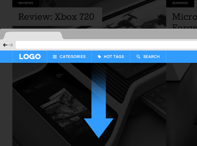
Hasilnya teman-teman bisa lihat